Category:
Magazine publication
Client:
Deep
Visual identity and layout design for a magazine publication.
THE TASK
Create a magazine to allow people to re-experience music the old school way by stepping away from online content, replacing the screen with an edgy, punky and bold magazine.

THE BIG IDEA
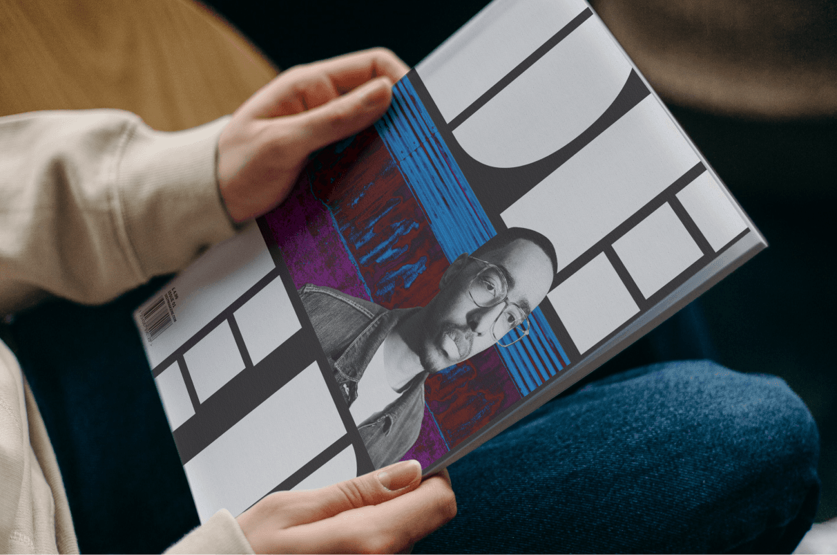
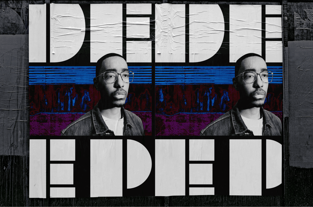
The Big Idea; a deeper insight into your favourite artists. This gave way to naming the magazine DEEP.
THE PROCESS
I started the project by mapping the big idea and the unique selling point of the publication. I wanted to deliver something unique, offering music lovers a look into what their favourite musicians get up to, away from the music.
Once the idea and USP was established, I generated keywords for the look and feel of the magazine; radical, distinctive and energetic.
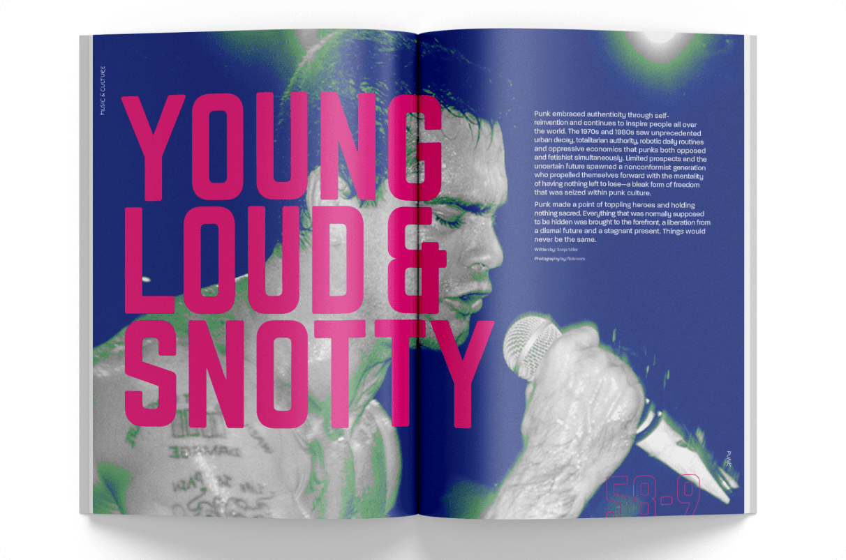
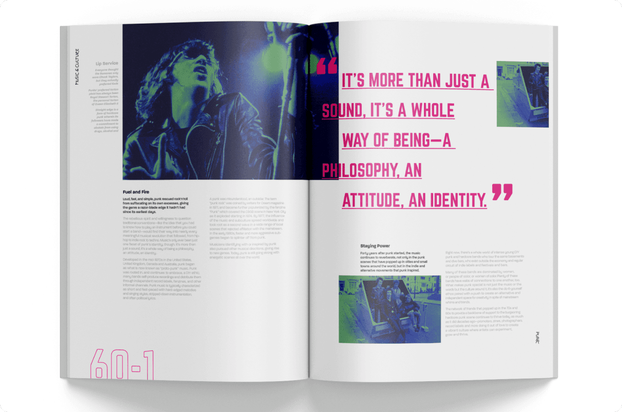
I wanted the featured article to be energetic, injecting electric pink in the stylised pull quotes and two-tone colour overlays for the image treatment. I used the exaggerated double page numbers to give a distinctive edge, whilst allowing white space and discreet page furniture for a higher end look and feel.

CHALLENGES / OUTCOMES
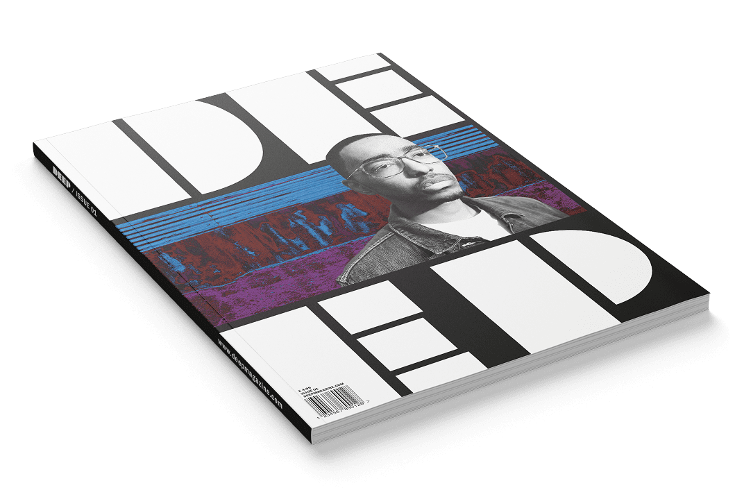
One challenge I encountered after mood boarding the design features, was the masthead. As I wanted the design to be bold and distinctive, I looked at double exposed image treatment, but during the design process I felt it wasn’t working with the texture and colour way of the backdrop. I overcame this issue by making the image grey scale and removing the double exposure.
Another obstacle was the body copy. At the time I had limited experience with working the rag, but as I persevered, I grew to love it and enjoyed the challenge of making the words fit beautifully on the page.
This project came runner up in the Shutterstock X Lectures in Progress graduate competition.