Category:
Visual Identity & Digital
Client:
Spaark
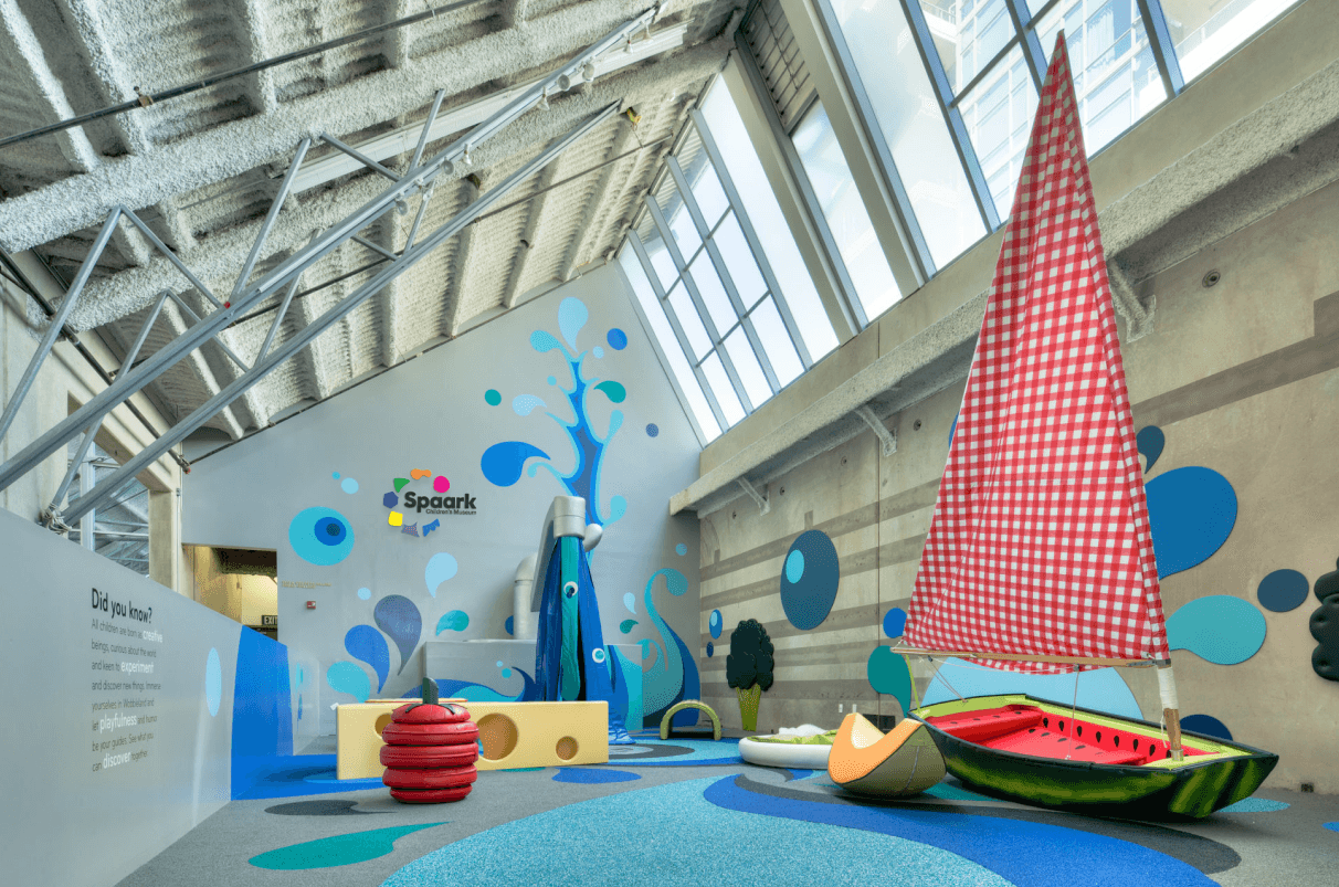
Visual identity and digital experience for an interactive creative museum for children.
THE TASK
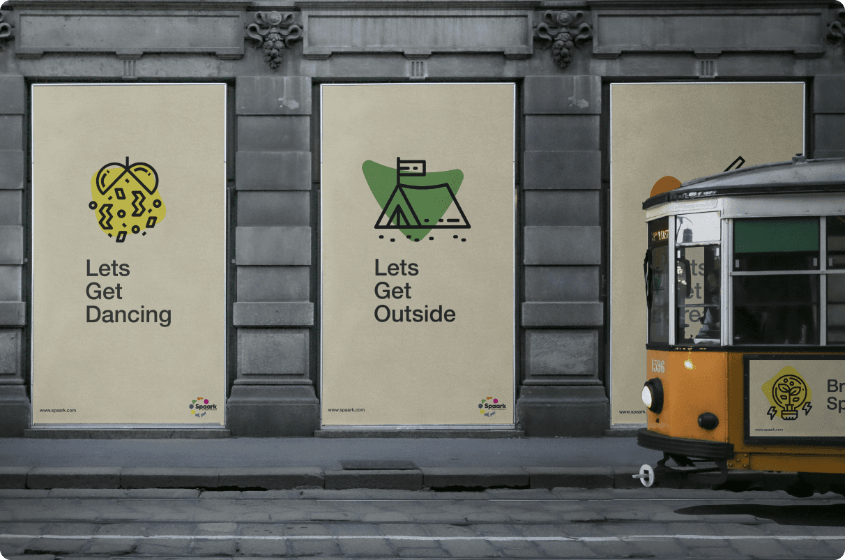
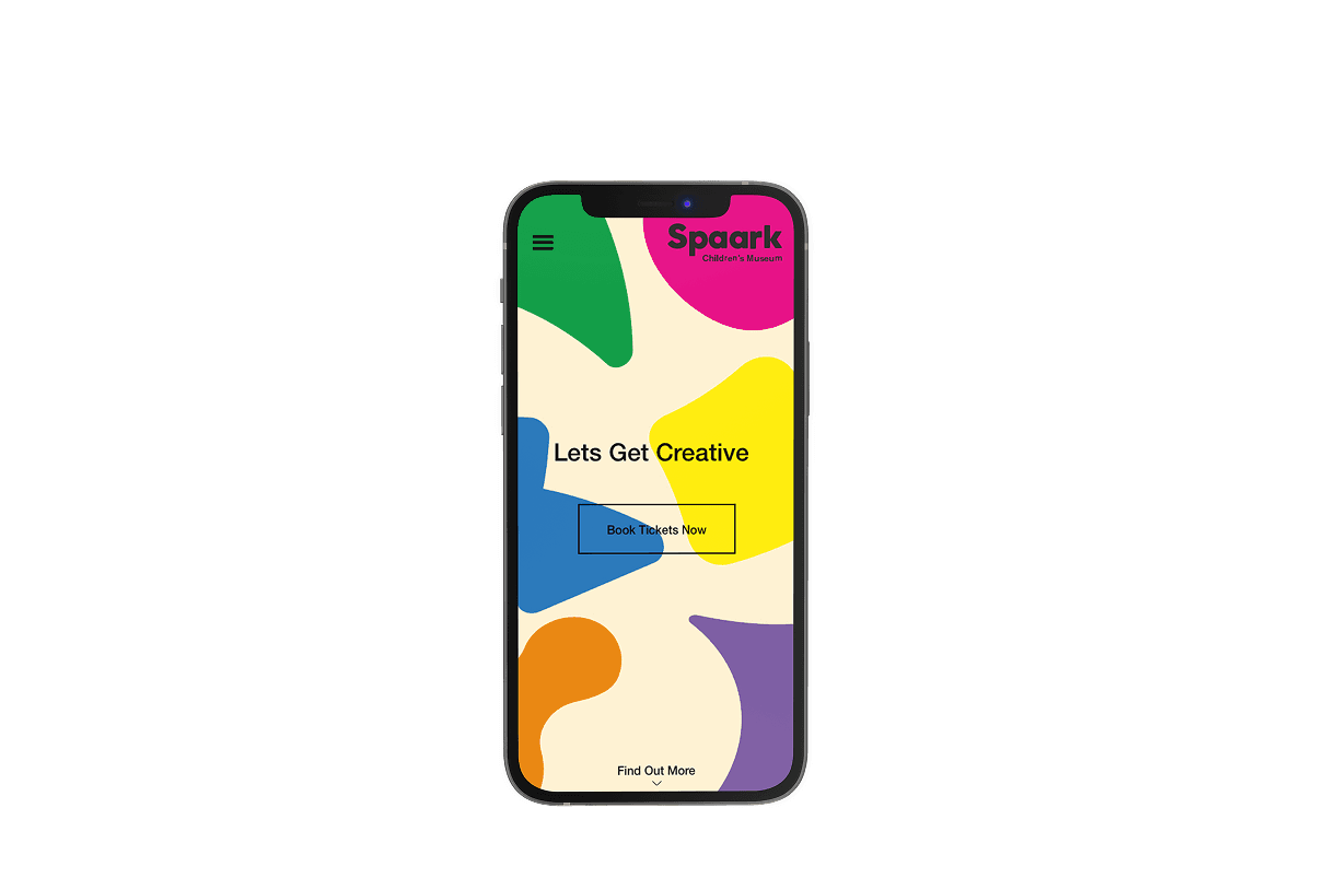
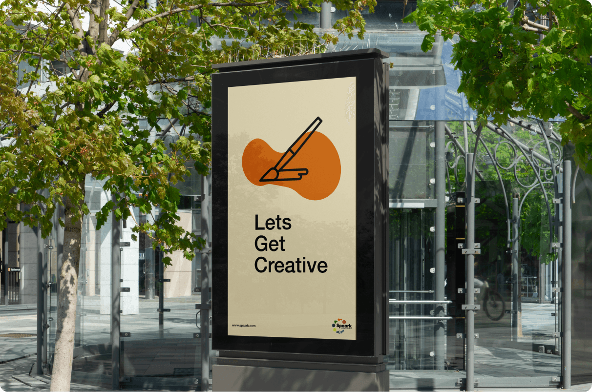
The client wanted their new branding to boost footfall and convey the message of the museum, whilst being exciting and accessible.
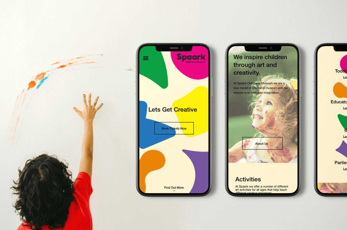
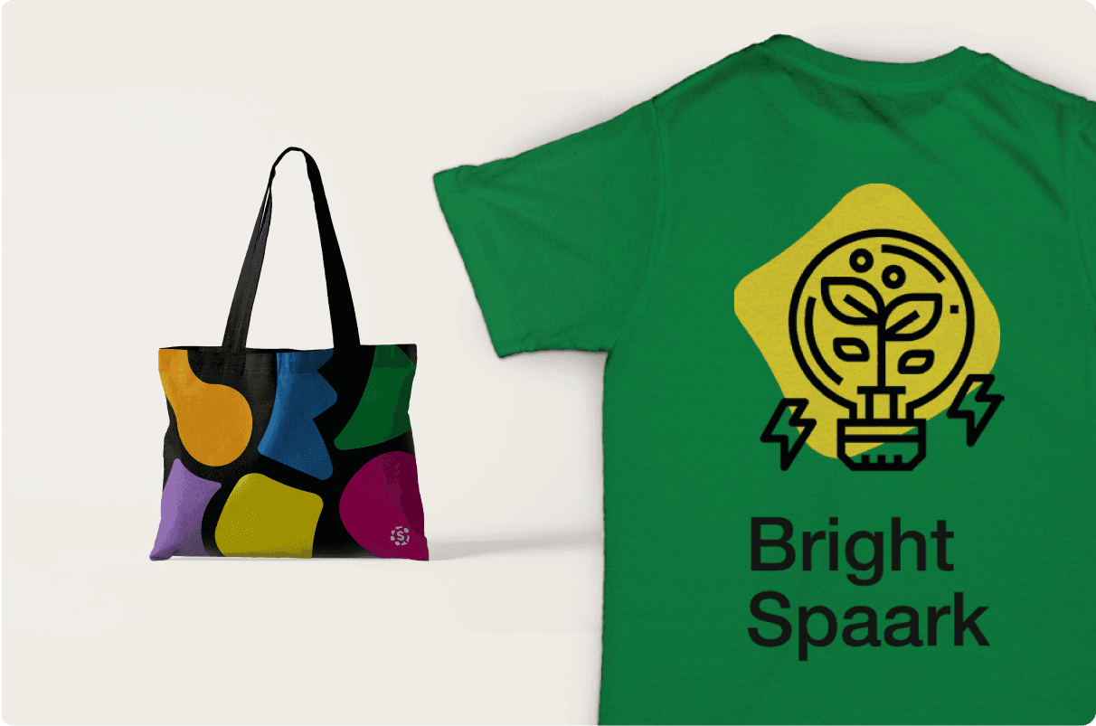
They wanted their new branding to be flexible and work across a broad range of collateral.
THE BIG IDEA
The Big Idea; help children with their creative development through education, interaction and installations.
THE PROCESS
I researched the museum’s current branding, demographic, and their competitors to further understand the market. I then started thinking of how the client could differ from their competitors.
After establishing the client’s USP and exploring different possibilities through ideation, I conceptualised the brand values; encourage, innovate and develop.
The museum was built on the idea of teaching children through the power of creativity and interaction.
The branding needed to evoke the exciting possibilities the museum has to offer. I wanted to create the feeling of fun and playful, balanced with cultivating learning.
CHALLENGES / OUTCOMES
During the design stage I had to overcome the cliché’s associated with the target audience, whilst still remaining appealing to them and enticing for their parents.
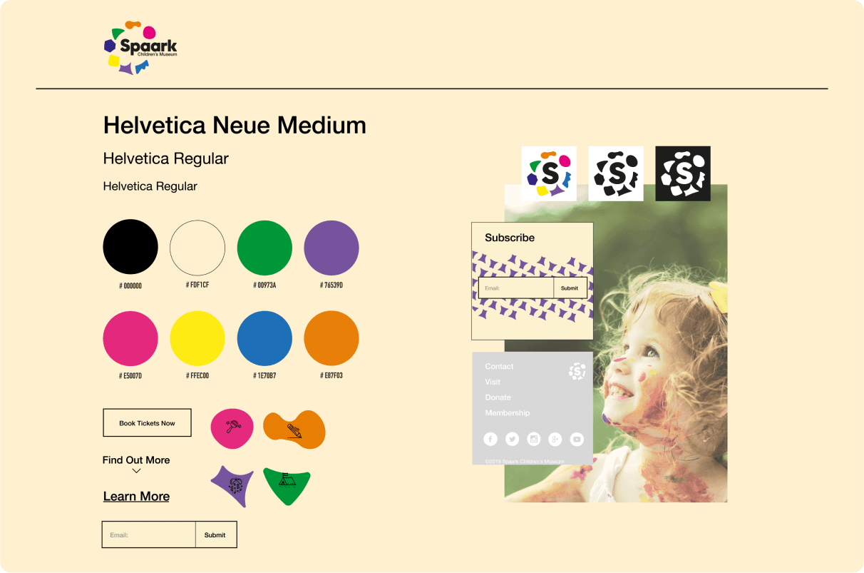
I achieved this by using a clean Sans–Serif typefaces and a minimalist layout, married with a selection of vivid colours to form the flexible logo elements. I introduced the softer colour palette for the backdrop to create contrast and balance to appeal to both the children and their parents.
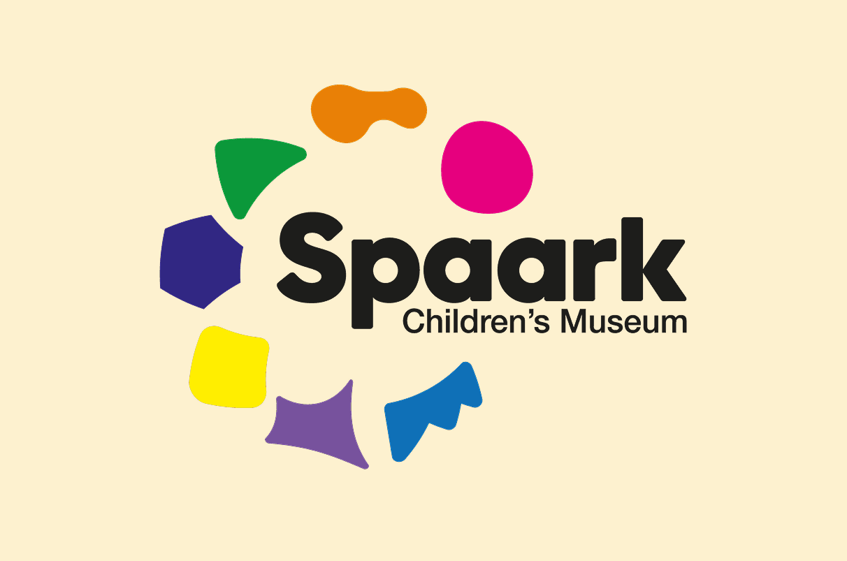
Another obstacle I encountered was the logo mark. I tried a number of variations using shapes taken from the architecture of the museum. The light bulb moment happened when I pieced all the shapes together to form the logo showcased above.