Category:
Design & digital
Client:
Jamon
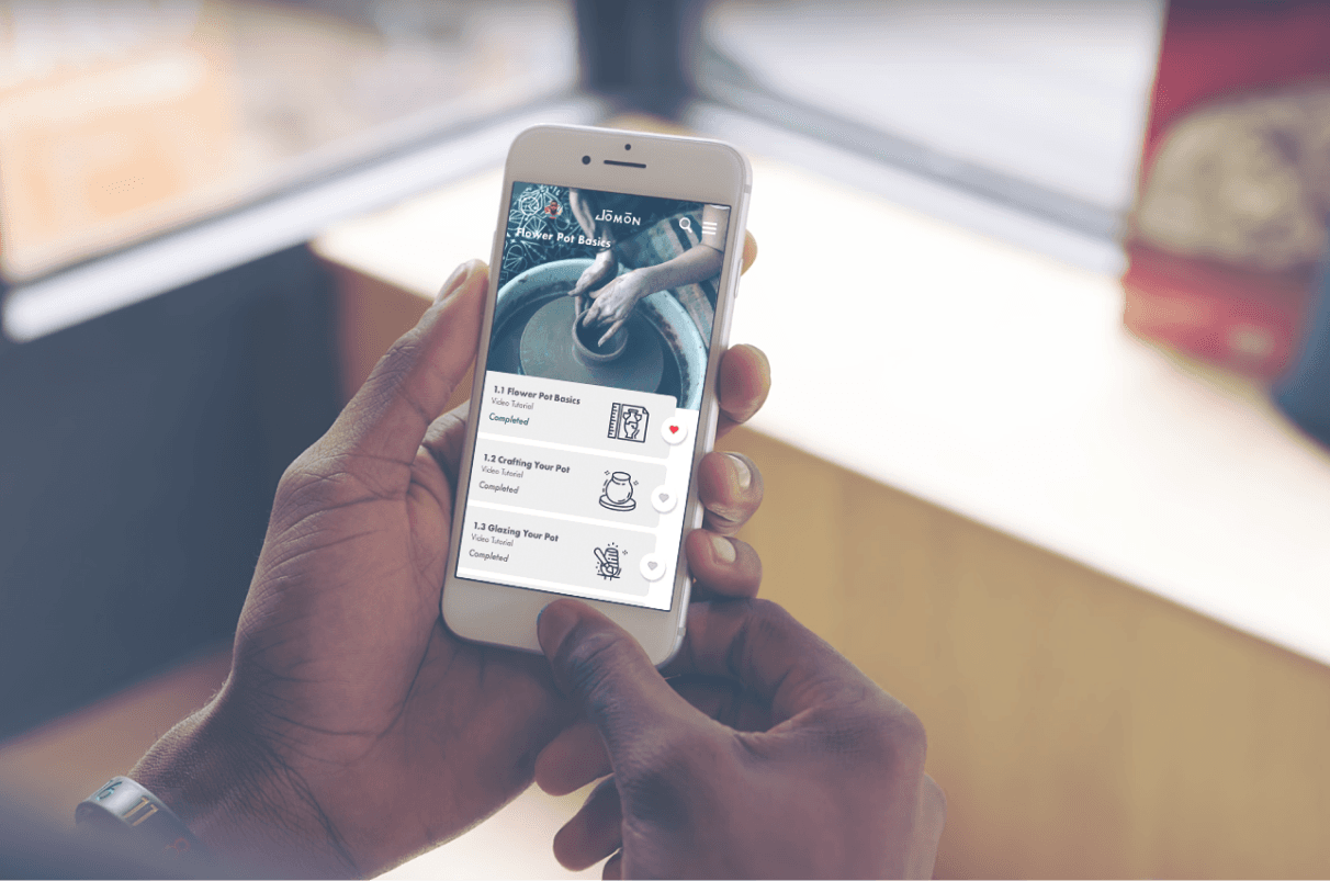
Design and digital experience for an app for pottery enthusiasts.
THE TASK
This app was created to be the, go to place, for pottery lovers to communicate, share their creations and learn new skills, whilst helping to develop a community and build a membership focusing on a younger market.

THE BIG IDEA
The Big Idea; bringing young professionals closer together through the art of pottery.
THE PROCESS
I researched the history of pottery looking at the different types of ceramics. During the naming process there were a few failed attempts before settling on the name Jomon, which is ancient earthenware pottery from Japan.
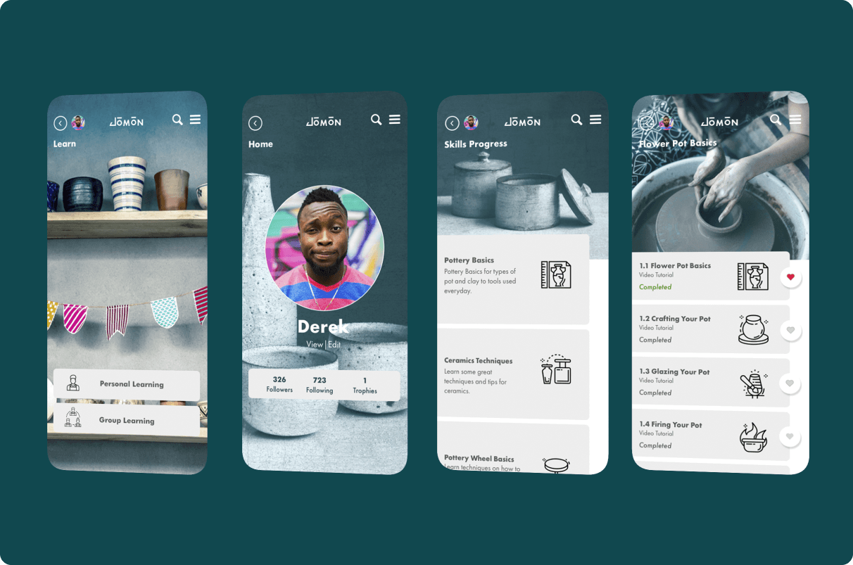
I then identified the primary and secondary aims of the app to determine the app framework, which informed the design. I then developed persona's, created multiple user journey's, organised tasks into a user flow, developed thumbnails and then created the wireframes before running user testing.
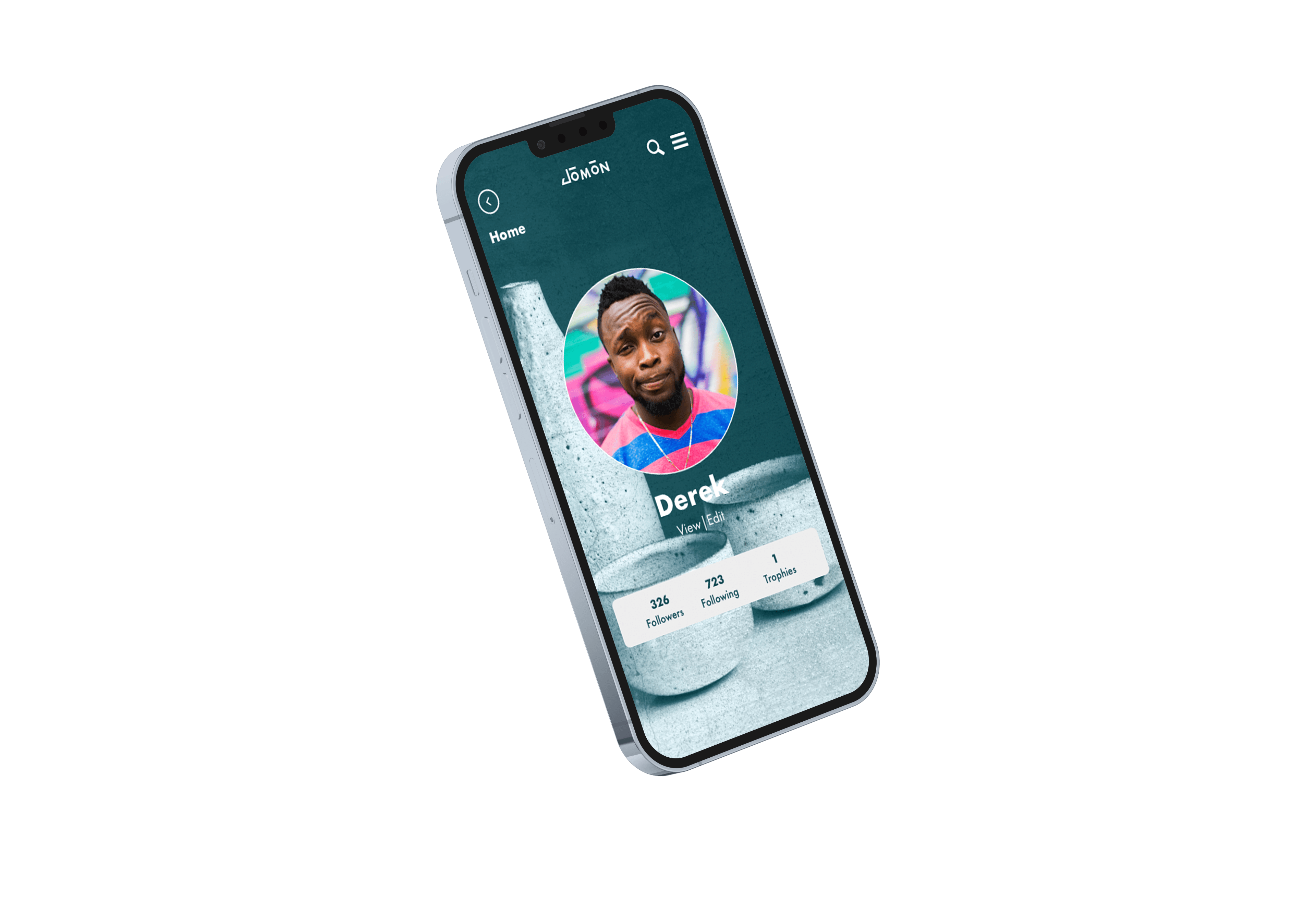
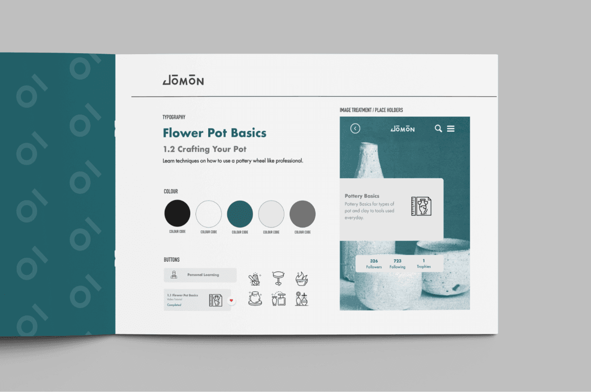
Once the wire-framing was complete, I started the skinning process, mapping out the keywords; modern, stylish and clean for the look and feel.
Considering the target audience and keywords, modern, stylish and clean. I felt simplicity, minimalism and functionality was key, leading me to using Scandinavian design for the inspiration.
I used a muted colour palette to create a modern sense of style and chic, teaming this up with clear user friendly and functional elements that sit comfortably with the illustrated icons, which inject a little fun for the younger audience.
The typography was chosen to reflect clean, simple and young with the aim of not overpowering the overall look and feel. The typefaces chosen to create the lock- up were picked for their resemblance to pottery.
CHALLENGES / OUTCOMES
The initial styling of this project slightly resembled more of a banking app than a pottery app, but I overcame this by further understanding the target audience and thinking about the styling they may have in their own homes and places they would visit for recreation.