Category:
Packaging Design
Client:
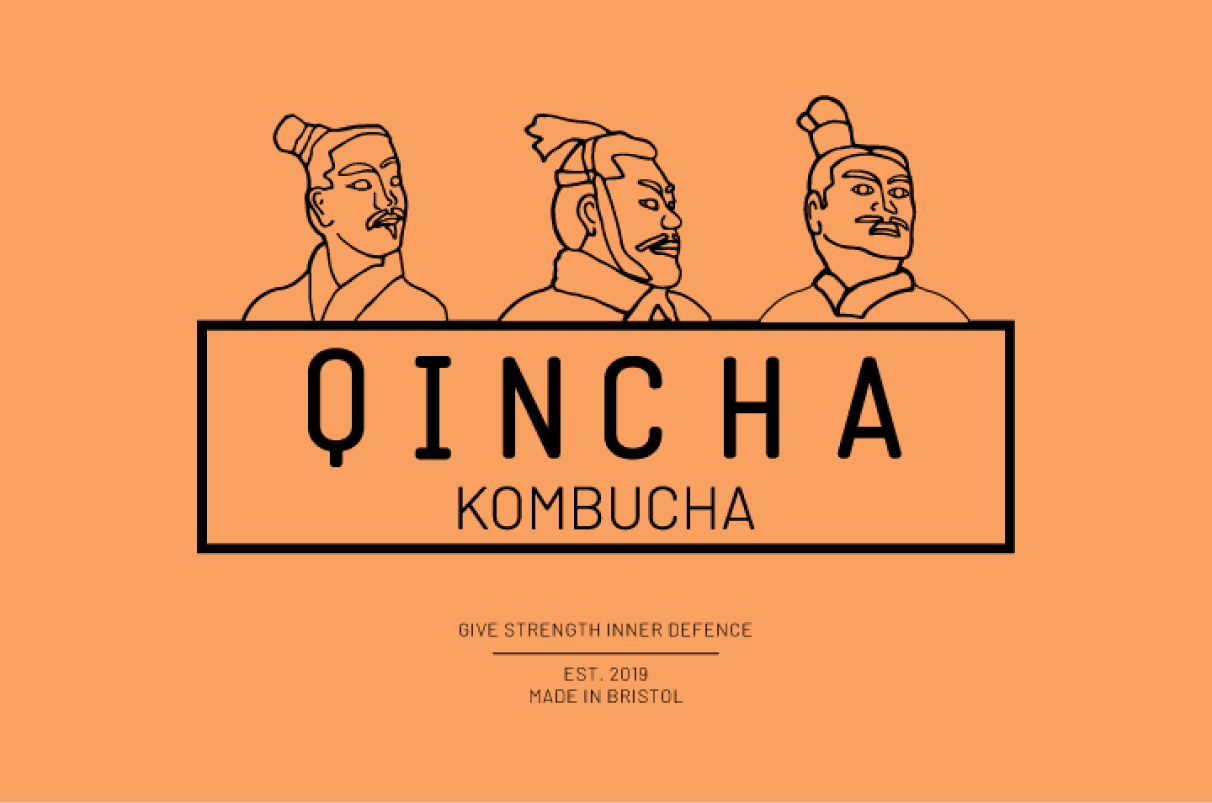
Qincha
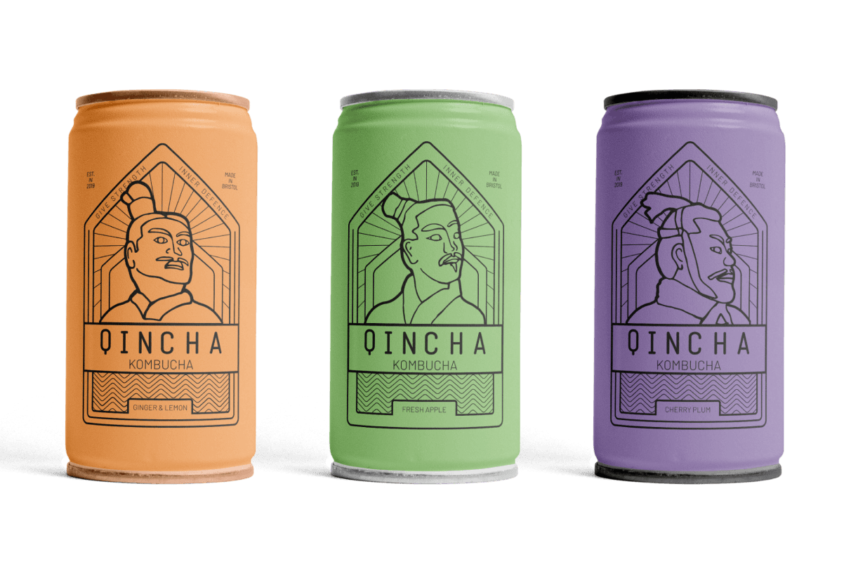
Packaging solution for a kombucha drink.
THE TASK
Create a boutique and luxury packaging solution with a brand story for a brand new kombucha drink.

THE BIG IDEA
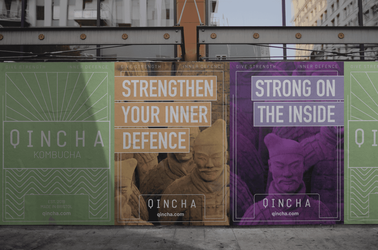
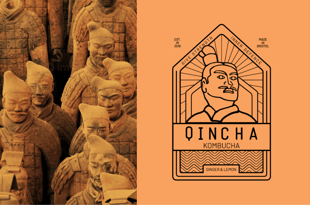
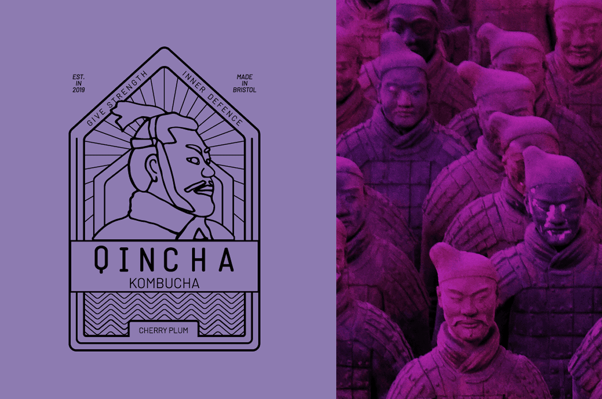
The Big Idea; give strength, inner defence.
THE PROCESS
After researching the history of kombucha to gain understanding of its origins and its benefits, I conducted market research, considering factors such as; place in the market, competitors, target audience, how to make the product unique, and potential additional product range.
I narrowed down the demographic and focused on the brand story using the research to emphasis the history to give the product an authentic backstory.
Using keywords from the ideation and backstory the naming process began, initially choosing Kucha. However, I didn’t feel this was right, so I paused and revisited the research. After some feedback, I decided on the name Qincha, linking its beginnings from the Qin dynasty in China and the name kombucha, to build seeds of recognition for the consumer.
Through ideation, I developed the brand values, visual keywords and the big idea.
CHALLENGES / OUTCOMES
I wanted to reflect the heritage within the product initially considering the classic painting The Wave for the main graphic, and then realised that The Wave is Japanese. So, I returned to the research, which led me towards the Terracotta Army. This visualised the strength of the product. I chose uncomplicated, linear design and illustrations to emphasise a quiet, confident strength and reference the heritage.
The typography needed to sit comfortably within the linear design, whilst being distinct enough to stand out in a crowded market. The supporting typeface had an important role to play in this project, being versatile enough to not overpower the illustration but come alive in the campaign.