Category:
Visual identity & digital
Client:
Tripod

Visual identity rebrand and digital experience for a Health and social care recruitment company.
THE TASK
Tripod partners are a recruitment company within the medical field, who felt they had out grown their bland offering and wanted a new brand that reflected who they are today. The only requirement left on the table was their name must stay the same.

THE BIG IDEA
Their objective was clear, expand outside the UK in 12 months and become the preferred provider in their market.
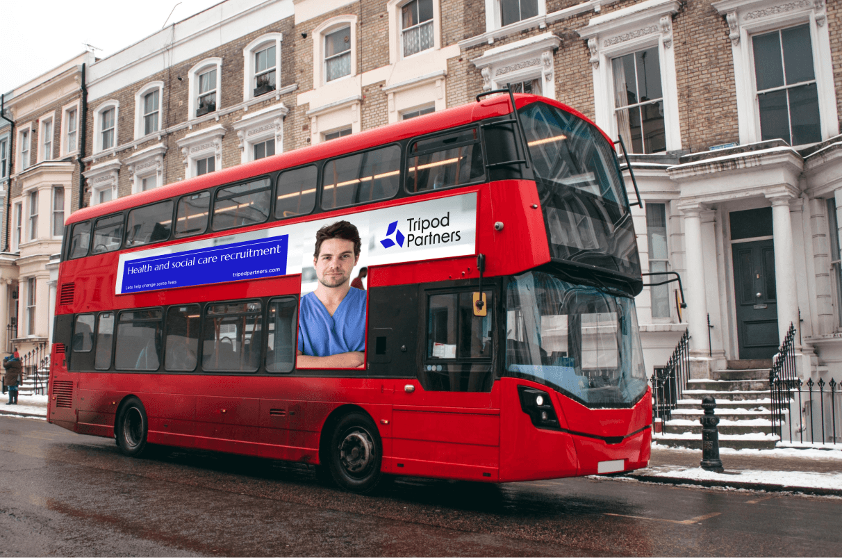
With expansion on the horizon, we needed to get all eyes on Tripod. The Big Idea; your global medical recruiter that feels closer than your locum.
THE PROCESS
After identifying the project goals and objectives, I started delving into the market, which felt paired back and somewhat generic.
After I established the brand idea, I began ideating, generating the keywords; dependable, modern and energetic for the look and feel.
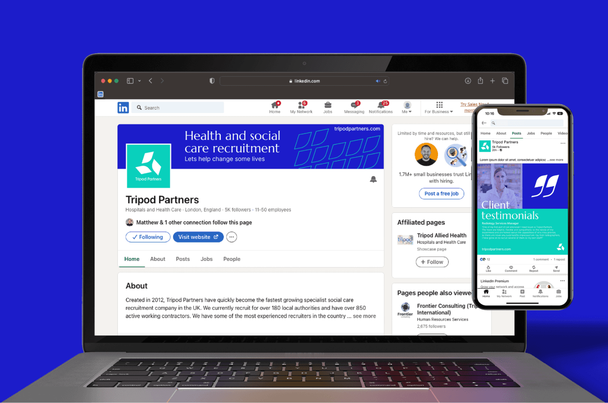
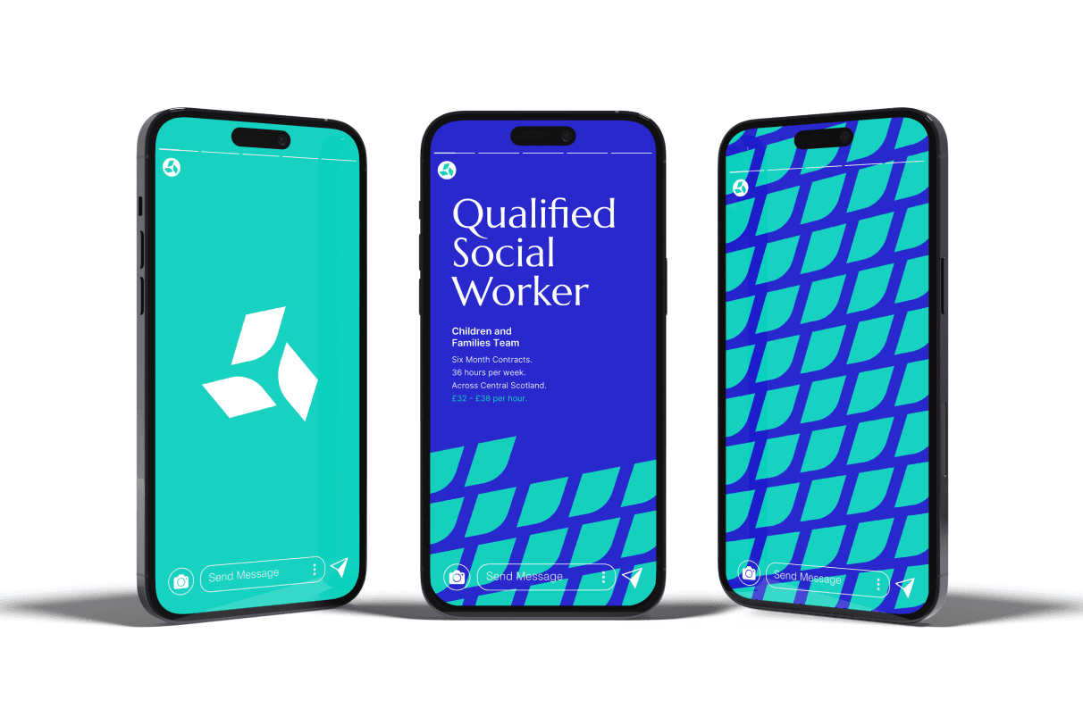
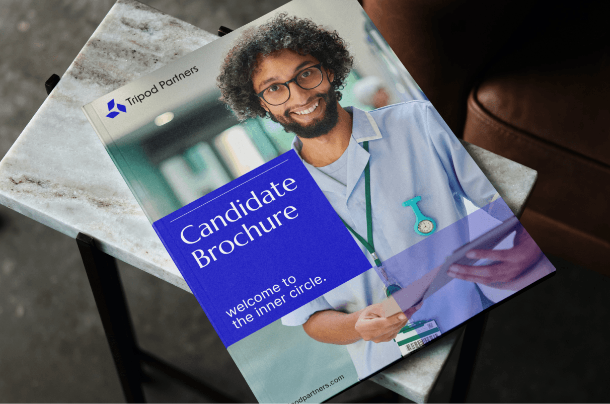
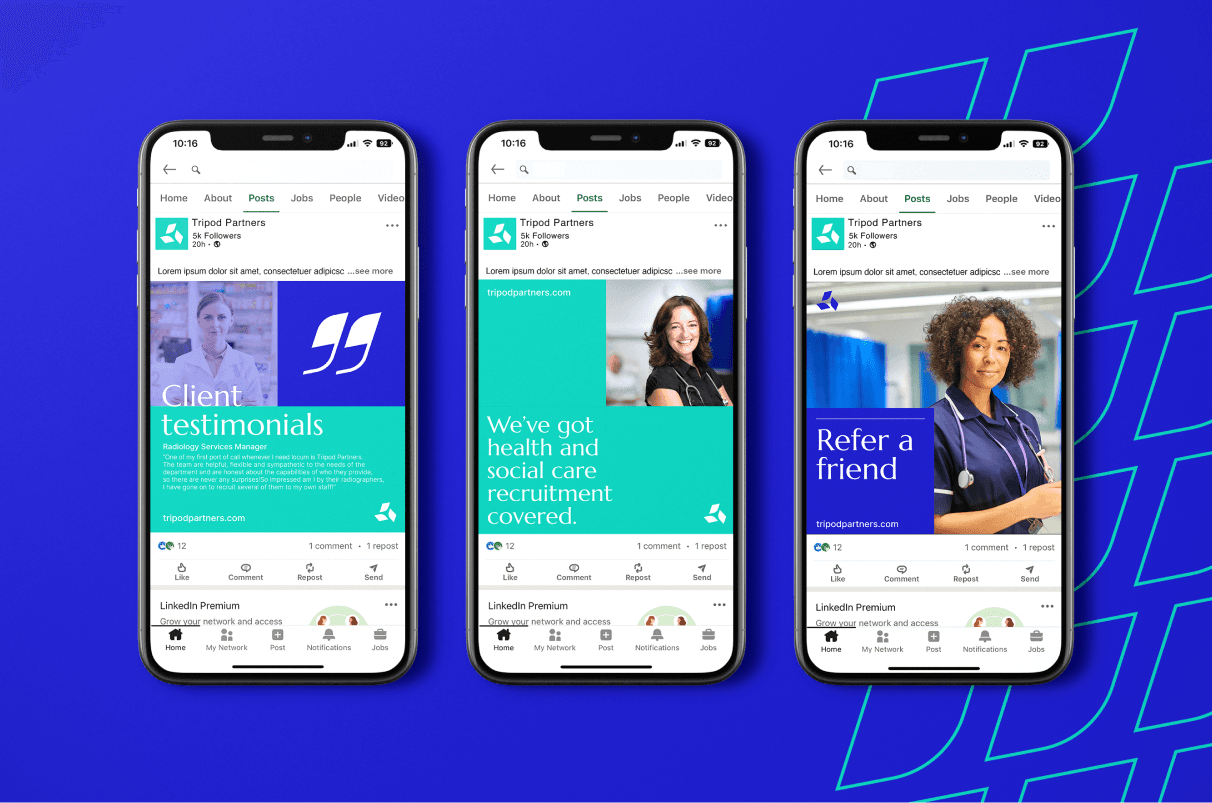
After gathering inspiration for the project, I began the design process. I introduced a grid system within the design to build a reliable and professional layout, which helped to create consistency across all touch points with the aim of making Tripod a truly unforgettable brand.
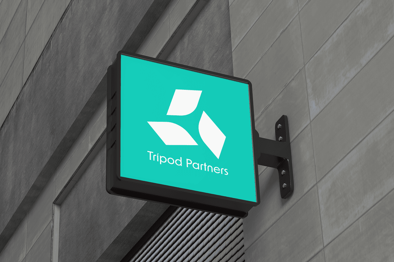
A logo mark with a mixture of straight and curved edges, supported by a word mark that utilises typography with the same characteristics, depicting Tripods professionalism and personable nature. Married with a colour palette chosen for its trust worthy and dependable connotations, whilst remaining modern and energetic.
CHALLENGES / OUTCOMES
This concept was created during my time working at an agency. Sadly this concept wasn’t fully chosen, instead they opted for a mix of this and a more muted concept. But I love it all the same, so I had to showcase it.